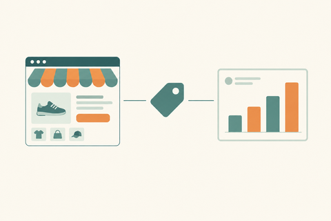
How a Shopify Redesign Increased Conversion by 3X
Getting traffic to your Shopify store is only half the battle. If your Shopify redesign hasn't kept pace with evolving buyer expectations, that traffic is quietly leaking revenue every single day. Outdated design, poor mobile UX, slow loading speeds, and confusing navigation are silent conversion killers — and most store owners don't realize the damage until they look at the numbers. This Shopify redesign case study shows exactly how one D2C brand stopped the bleed and tripled its conversion rate with a strategic, data-driven redesign by Thriftizernest.
About the Brand: Velour & Co.
Velour & Co. is a D2C fashion and lifestyle brand selling premium athleisure and loungewear for women aged 24–42 across India. Operating on Shopify, the brand had built a loyal social media following and was driving solid paid traffic — but the store wasn't converting.
- Industry: Fashion & Lifestyle (Athleisure)
- Platform: Shopify
- Monthly Traffic: ~35,000 sessions/month
- Conversion Rate (Pre-Redesign): 0.8%
- Core Problem: High traffic, low sales, stagnant revenue growth
Despite spending ₹2.5 Lakhs/month on Meta Ads, Velour & Co. was generating only 280 orders per month — a clear sign the store experience was failing buyers, not the ads.
Problems Identified Before the Shopify Store Redesign
Thriftizernest conducted a full Shopify UX optimization audit before touching a single pixel. Here's what we found:
- High Bounce Rate (71%): Visitors were landing and leaving within seconds — the homepage failed to communicate value instantly
- Poor Mobile Conversion Rate (0.4%): Over 80% of traffic came from mobile, but the mobile experience was clunky and unoptimized
- Weak Product Pages: Low-quality images, no size guides, missing reviews, and no urgency signals
- Slow Page Speed: Homepage loaded in 6.8 seconds on mobile — well above the 3-second drop-off threshold
- Buried CTAs: Add-to-cart buttons were below the fold on mobile; users had to scroll to find them
- Complicated Checkout: A 5-step checkout with mandatory account creation was causing massive drop-off
- Inconsistent Branding: Mismatched fonts, colors, and imagery across pages eroded trust and brand credibility
Shopify Redesign Strategy Implemented by Thriftizernest
Our ecommerce redesign approach was built around one principle: every design decision must serve conversion. Here's what we rebuilt:
1. Mobile-First UI/UX
- Redesigned every page layout for mobile-first rendering
- Implemented sticky add-to-cart buttons visible at all scroll depths
- Optimized tap targets, font sizes, and image ratios for mobile screens
2. Shopify Speed Optimization
- Compressed and lazy-loaded all product images using next-gen formats
- Removed unused apps and redundant JavaScript to reduce page bloat
- Reduced mobile homepage load time from 6.8s to 2.1s
3. Conversion-Focused Homepage & Navigation
- Rebuilt the homepage with a clear value proposition above the fold
- Simplified navigation to 4 primary categories with smart mega-menu filtering
- Added social proof banners, trust badges, and press mentions in the hero section
4. Improved Product Pages
- Added high-resolution lifestyle imagery with zoom and 360° view
- Integrated Judge.me reviews with photo UGC directly on product pages
- Added size guides, fit recommendations, and low-stock urgency indicators
5. Streamlined Checkout & Shopify Checkout Optimization
- Enabled guest checkout and reduced checkout steps from 5 to 2
- Added Shop Pay and UPI as one-tap payment options
- Implemented cart drawer with upsell recommendations to increase AOV
6. Better Collection Filtering
- Added faceted filtering by size, color, price, and style
- Enabled infinite scroll with quick-add-to-cart from collection pages
Results After the Shopify Redesign
Within 60 days of launching the redesigned store, Velour & Co. saw dramatic improvements across every key metric:
| Metric | Before Redesign | After Redesign | Change |
|---|---|---|---|
| Conversion Rate | 0.8% | 2.4% | +200% (3X) |
| Bounce Rate | 71% | 37% | -48% |
| Mobile Sales Share | 31% | 48% | +55% |
| Average Order Value (AOV) | ₹1,240 | ₹1,699 | +37% |
| Page Load Speed (Mobile) | 6.8 seconds | 2.1 seconds | -69% |
| Monthly Orders | 280 | 756 | +170% |
| Session Duration | 1m 12s | 3m 04s | +155% |
Monthly revenue grew from ₹3.47 Lakhs to ₹12.8 Lakhs — without increasing ad spend by a single rupee.
Why the Shopify Redesign Worked
This ecommerce redesign case study succeeded because the redesign was built around buyer psychology, not just visual aesthetics. Key drivers of success:
- Better Buyer Journey: Every page was mapped to a stage in the purchase funnel — awareness, consideration, decision
- Mobile Optimization: Designing for the 80% of mobile users first eliminated the biggest conversion gap
- Faster Loading Pages: A 69% improvement in load speed directly reduced bounce rates and improved Google rankings
- Stronger Visual Hierarchy: Clear CTAs, scannable layouts, and bold product imagery guided users toward purchase
- Trust Signals: Reviews, badges, and press mentions reduced purchase hesitation significantly
- Checkout Simplification: Removing friction from checkout alone recovered an estimated 22% of previously lost orders
How Thriftizernest Helps Shopify Brands Grow
Thriftizernest is a specialist Shopify redesign agency and ecommerce growth partner for D2C brands, fashion labels, and Shopify Plus merchants. We combine UX expertise with conversion science to build stores that don't just look great — they sell.
Our Shopify website redesign services include:
- Shopify Redesign & Development: Full store redesigns built on OS 2.0 themes with custom sections
- Shopify CRO Optimization: Heatmap analysis, A/B testing, and funnel audits to identify and fix conversion leaks
- Mobile UX Optimization: Mobile-first design systems that convert the majority of your traffic
- Shopify Speed Optimization: Technical performance audits and Core Web Vitals improvements
- Shopify Plus Development: Custom checkout extensibility, B2B features, and multi-market configurations
Common Shopify Redesign Mistakes to Avoid
A redesign can hurt as much as it helps if done wrong. Watch out for these costly mistakes:
- Designing Only for Aesthetics: Beautiful stores that don't convert are expensive mistakes — every design choice must serve a conversion goal
- Ignoring Mobile Users: If your redesign isn't mobile-first, you're optimizing for a minority of your traffic
- Removing SEO Structure: Changing URL handles, H1 tags, or page structures without redirects can destroy organic rankings overnight
- Poor Checkout Optimization: A redesigned storefront with a broken or complex checkout still loses sales at the final step
- Overcomplicated Navigation: More menu items ≠ better UX — simplicity drives faster decisions and higher conversions
- Not Testing Conversion Flows: Launching without A/B testing key pages means you're guessing, not optimizing
Conclusion
This Shopify conversion optimization case study makes one thing undeniable: a strategic, data-driven Shopify redesign is one of the highest-ROI investments a D2C brand can make. Velour & Co. tripled their conversion rate, grew monthly revenue by 3.7X, and did it all without increasing their ad budget — simply by fixing the store experience that was silently costing them sales.
If your Shopify store is getting traffic but not converting, the problem isn't your product. It's your store experience. And that's exactly what Thriftizernest fixes.
Want to increase your Shopify conversion rate?
Talk to Thriftizernest for a conversion-focused Shopify redesign built around your brand's growth goals.
Book a free Shopify UX audit today and discover exactly what's costing you conversions, and how to fix it.